Online success isn’t what you say—it’s how attention is earned, timed, and converted across moments.

Previous · Part 1
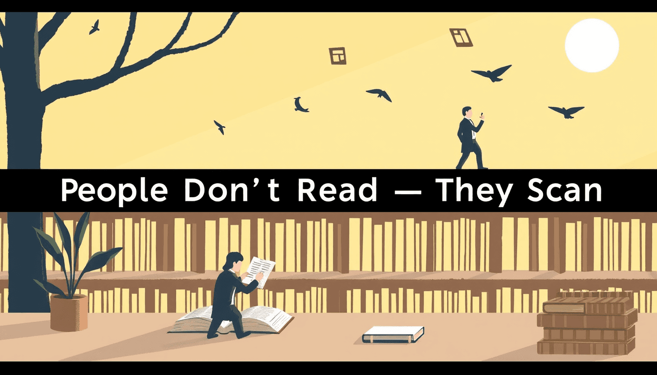
People Don’t Read — They Scan: Designing for Digital Attention
Next · Part 3
The Quiet Majority: How Lurkers Drive Everything
This builds on Part 1: People Don’t Read — They Scan: Designing for Digital Attention
Continue with Part 3: The Quiet Majority: How Lurkers Drive Everything
The Scroll Is the Default State
Most online engagement isn’t chosen. It’s caught.
People are not entering your page with a deliberate reading plan. They’re already in motion—scrolling, skimming, switching contexts. Your “audience” isn’t deciding between interest and boredom. They’re deciding between continuing the current loop and interrupting it.
Engagement as background noise (until it isn’t)
Think of attention online like weather. It changes constantly, and most of the time you simply move through it.
That’s why passive engagement dominates:
- Small exposures (hovering near content, micro-reads, partial view)
- Low-effort responses (staying, pausing, continuing)
- Implicit signals (where the cursor lingers, what gets re-shown, what gets scrolled back into)
Intent may exist in pockets. But the baseline is drift.
Your job: earn interruption, not comprehension
If most engagement is passive, the funnel changes. Early success isn’t “they read.” It’s “they didn’t leave.”
So you structure for interruption:
- Clarity at a glance: make the page legible within seconds
- Signal over substance: lead with what matters, not how it’s built
- Continuity: remove friction that causes the scroll to resume immediately
- Momentum: keep the next step visually and cognitively close
Passive doesn’t mean indifferent
Here’s the trap: passive engagement can look like low commitment. But it often reflects processing that hasn’t resolved yet.
People may not commit to reading—yet. They may be forming a weak preference:
- “This seems relevant.”
- “This feels worth revisiting.”
- “I might share later.”
- “I’ll come back when I have the right moment.”
You’re not only selling today. You’re laying tracks for tomorrow.
Design cues that convert drift into attention
You don’t need to force the reader to “stop.” You need to make stopping feel natural—almost inevitable.
Use these cues:
- Pattern breaks (a line that resolves, a question that frames, a section that changes rhythm)
- Meaningful chunking (headings that function like destinations, not ornaments)
- Visual pacing (whitespace, contrast, and progression that guide the eye)
- Context scaffolding (micro-frames that tell the reader why anything here matters)
A practical model: Drift → Contact → Choice
Most users move through your interface in three phases:
-
Drift
They’re traveling. Your job is not to get in their way. -
Contact
Something registers. This is where your clarity, structure, and promise earn a second beat. -
Choice
They decide whether to continue, dive deeper, or disengage.
If you only optimize the “choice” phase (the call-to-action, the argument, the depth), you’ll underperform—because you never made contact long enough for choice to matter.
Build this into your next draft
Steps: Optimize for passive engagement
Checklist: Quick audit for your page
Prompt: Make the page earn its second beat
Where are you currently asking for intentional reading—when your audience is mainly drifting? Identify one moment on the page where you could replace “explain” with “signal.”
Rewrite your first paragraph as if the reader only sees 2 lines before they decide to continue. What promise would you make, and what would you remove?
Practical takeaway
If this resonates, see how to apply it to your own work with the interactive Dispatch agent.
Be first to like this dispatch