Realism isn’t a look—it’s the consistent physics of causes across geometry, light, and camera capture.

Previous · Part 3
Prompts That Feel Real: Extreme Real-Camera Effects (Without Killing the Image)
Next · Part 5
Lens Logic for AI Prompts: How Focal Length Rewrites Your Scene
This builds on Part 3: Prompts That Feel Real: Extreme Real-Camera Effects (Without Killing the Image)
Continue with Part 5: Lens Logic for AI Prompts: How Focal Length Rewrites Your Scene
The real giveaway isn’t “bad texture.”
It’s the physics not agreeing with itself.
AI image models can approximate appearance—but they’re not naturally constrained by the causal chain that real cameras and optics enforce. So you get images that are pretty while quietly violating the underlying rules that humans use to judge “this could exist.”
Below are the seven most common failure modes that produce “unreal” results—each one a specific mismatch between what the image shows and what the physical world would have to do to produce it.
Failure Mode 1: Geometry That Doesn’t Line Up
When perspective, scale, and occlusion disagree, the brain flags it instantly.
Common symptoms:
- Edges that should meet (or occlude) don’t.
- Hands, products, door frames, and furniture corners bend subtly.
- Horizon lines and “where the camera is” feel wrong.
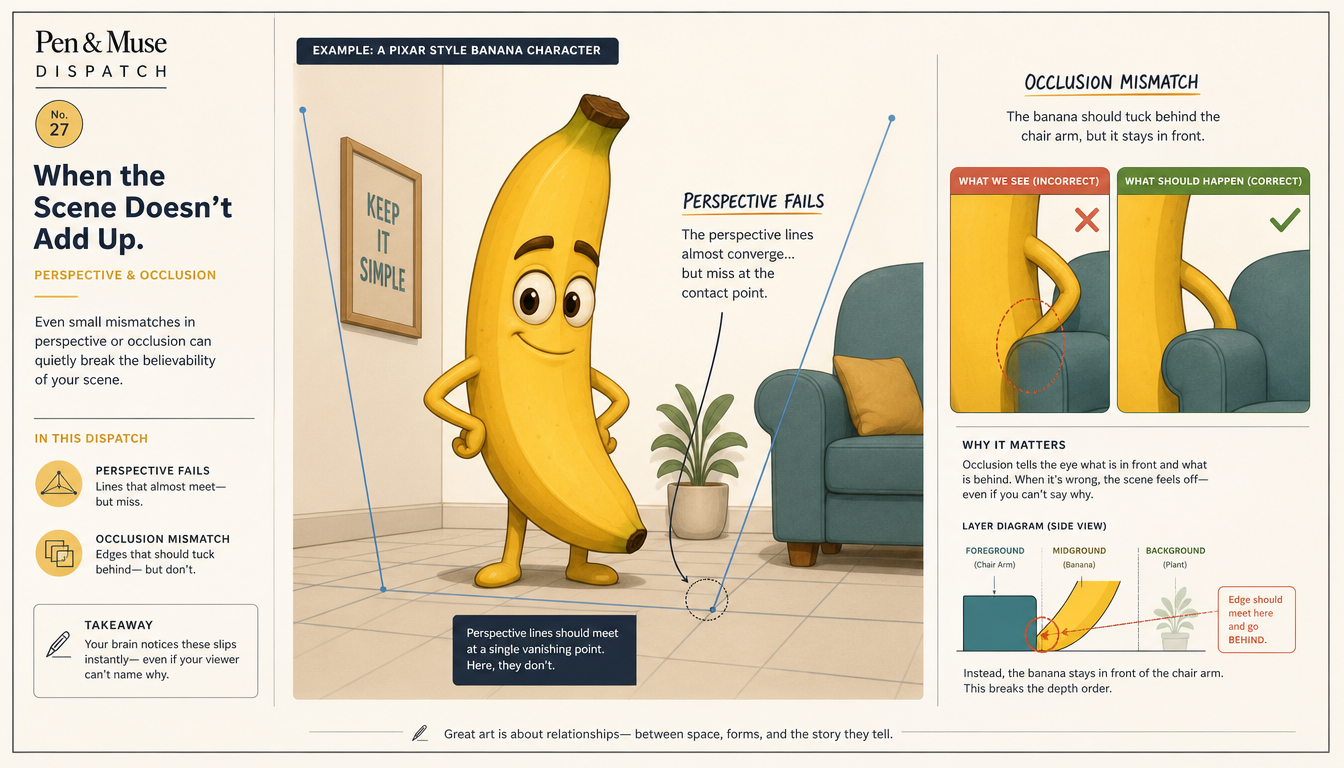
Why it looks fake:
Real cameras are brutally consistent about projective geometry. AI can draw plausible local shapes while globally breaking the 3D relationships.
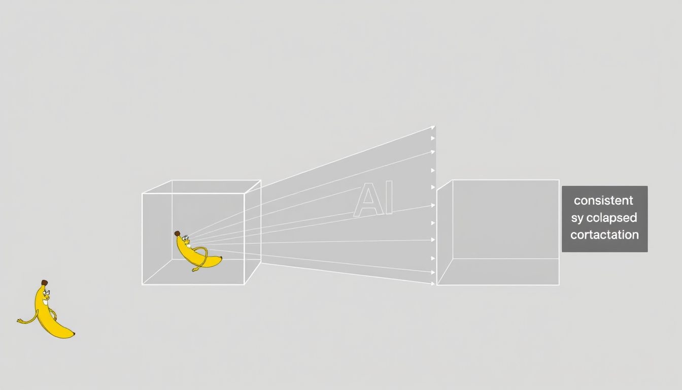
What to try (prompt-level):
- Anchor the scene with explicit camera position cues (“camera at waist height,” “shot from floor level”).
- Force contact/occlusion language (“in front of,” “partially hidden,” “touching the edge”).
- Reduce multi-object complexity until the geometry stabilizes.
Unlock the full applied series
Get all 15 parts of The Physics of Better AI Images — 92 min read · 18,266 words across the full sequence.
Inside the series
Parts 1-4: Constraints make it real
Parts 5-9: Camera causes, not vibes
Parts 10-12: Surfaces, framing, and truth priority
Parts 13-14: Repair and recipe workflows
Part 15: Master Prompt Sheet
Realism isn’t a look—it’s the consistent physics of causes across geometry, light, and camera capture.
Membership gives access to subscriber dispatches and ongoing Pen & Muse tools. This paid series is sold separately.
If this resonates, see how to apply it to your own work with the interactive Dispatch agent.
Be first to like this dispatch